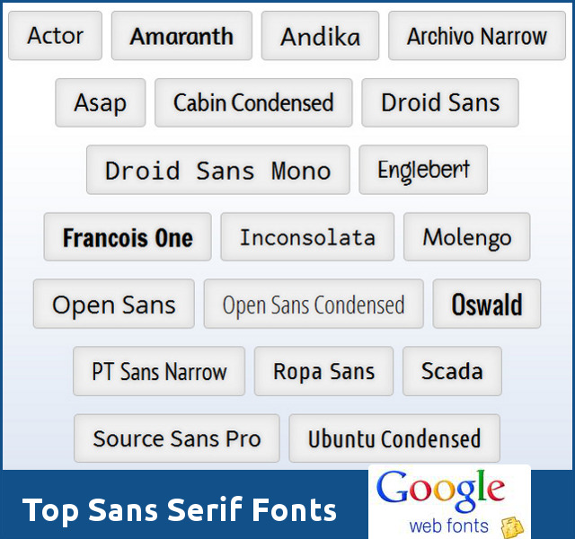
20 interesting Sans Serif fonts at Google Web Fonts
Google Web Font collection has plenty of interesting fonts. I tried to go through Sans Serif fonts in their collection and pick some good ones. You can use these fonts in your web design as well as graphics. It is not a comprehensive list, but includes those that grabbed my attention. Some of them are quite popular among designer community.
Click here to check out the 20 hand-picked Sans Serif fonts at Google Web Fonts website. Below are the samples of each individual font. If you want to download them from Google Web Fonts, just search for the font.

Actor has a strong x-height, which is why it always requires a fairly high line spacing. The digits of Actor are created as old style figures. The forms of 6 and 9 are more dynamic and more tense than usual. The 8 has significantly shifted interiors and the 7 is slightly curved to the left.

The Amaranth family is a friendly upright italic design with a slight contrast and distinctive curves. With its three new styles Amaranth is healthy for all your texts too!

Andika is a sans serif, Unicode-compliant font designed especially for literacy use, taking into account the needs of beginning readers. The focus is on clear, easy-to-perceive letterforms that will not be readily confused with one another.

Archivo Narrow was designed to be used simultaneously in print and digital platforms. The technical and aesthetic characteristics of the font are both crafted for high performance typography.

Asap is a contemporary sans-serif family with subtle rounded corners. Designed by Pablo Cosgaya, Asap (“as soon as possible”) there are 4 styles: Regular, Italic, Bold and Bold Italic. This family, specially developed for screen and desktop use, offers a standarised character width on all styles, which means lines of text remain the same length.

The Cabin font family is a humanist sans with 4 weights and true italics, inspired by Edward Johnston’s and Eric Gill’s typefaces, with a touch of modernism. Cabin incorporates modern proportions, optical adjustments, and some elements of the geometric sans.

Droid Sans Mono is a fixed width version of Droid Sans. The Droid Sans Mono fonts feature non-proportional spacing for displaying text in a tabular setting and other uses where a monospaced font is desired.

Droid Sans was designed with an upright stress, open forms and a neutral, yet friendly appearance. Droid Sans was optimized for user interfaces and to be comfortable for reading on a mobile handset in menus, web browser and other screen text.

Englebert is casual and playful in a mild manner, yet striking enough to catch the eye.

Francois One is a reworking of traditional sans serif gothic display typeface forms. In Francois One, the earlier letter forms have been digitised and then reshaped for use as a webfont, the counters have been opened up a little and the stems optimised for use as bold display font in modern web browsers.

Inconsolata is a monospace font, designed for printed code listings and the like.

Molengo is a Latin typeface for documents. It is multilingual and has some features required by many minority languages such as non-spacing mark placement.

Open Sans was designed with an upright stress, open forms and a neutral, yet friendly appearance. It was optimized for print, web, and mobile interfaces, and has excellent legibility characteristics in its letterforms.

The condensed form of Open Sans optimized for print, web, and mobile interfaces, and has excellent legibility characteristics in its letterforms.

The characters of Oswald have been re-drawn and reformed to better fit the pixel grid of standard digital screens. Oswald is designed to be used freely across the internet by web browsers on desktop computers, laptops and mobile devices.

PT Sans is based on Russian sans serif types of the second part of the 20th century, but at the same time has distinctive features of contemporary humanistic designs.

Ropa Sans was first designed as a homage to DIN and became a unique typeface during the work process.

Scada has a modern style, specifically designed for small sizes.

Source® Sans Pro, Adobe’s first open source typeface family, was designed by Paul D. Hunt. It is a sans serif typeface intended to work well in user interfaces.

The Ubuntu Font Family are a set of matching new libre/open fonts in development during 2010-2011. The development is being funded by Canonical Ltd on behalf the wider Free Software community and the Ubuntu project.
If you want to download the all fonts in the Google Web Font collection, you can easily do so from Google Code Project website.